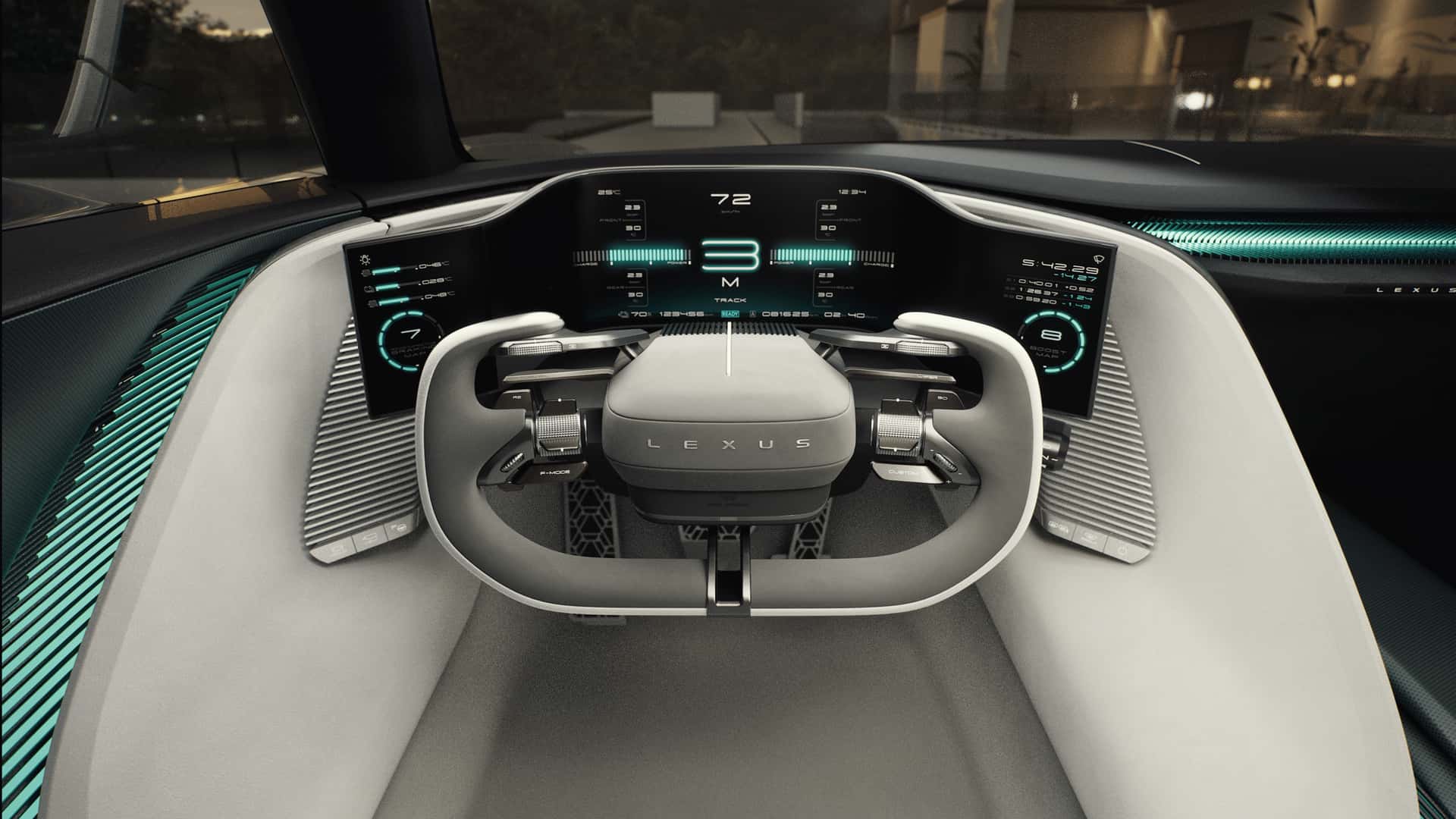
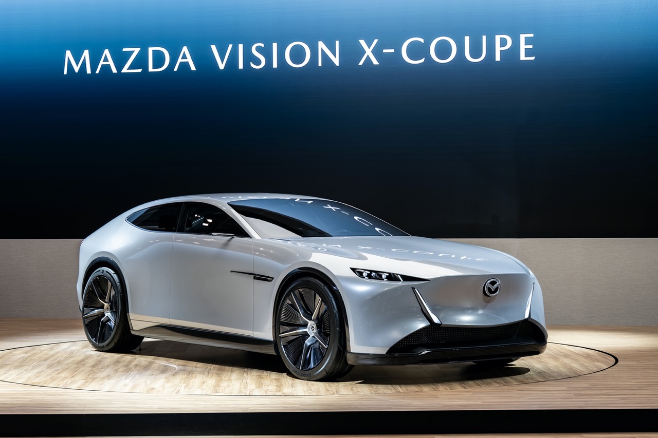
Mazda has officially taken the wraps off its brand-new logo, following its trademark registration last year. The redesigned emblem made its first public appearance at the Japan Mobility Show and has already been rolled out across Mazda’s official website and digital platforms.
The new design represents Mazda’s latest step in modernising its image for a digital-first world. Mazda says the move aims to enhance brand visibility and consistency, particularly in online environments where clarity and simplicity are key.
While the overall look has been refined, Mazda has kept the core identity intact. The familiar “M” shape that resembles a pair of outstretched wings remains the centrepiece, symbolising the brand’s spirit of flight and forward motion. This motif has been part of Mazda’s identity since 1997 and was last refreshed in 2018. The latest iteration softens the edges and removes the inner shading, creating a flatter, more minimalist aesthetic that feels both timeless and modern.
This update continues a long evolution of Mazda’s logo design over the decades. The company’s first logo, introduced in 1934, was a simple calligraphic wordmark that reflected its Japanese craftsmanship and cultural pride. Two years later, Mazda unveiled a 1936 emblem featuring three overlapping “M” shapes inspired by Hiroshima’s three rivers — an early interpretation of the “wings” motif that still defines its brand today.
![]()